Marcus Haslam
on 26 March 2018
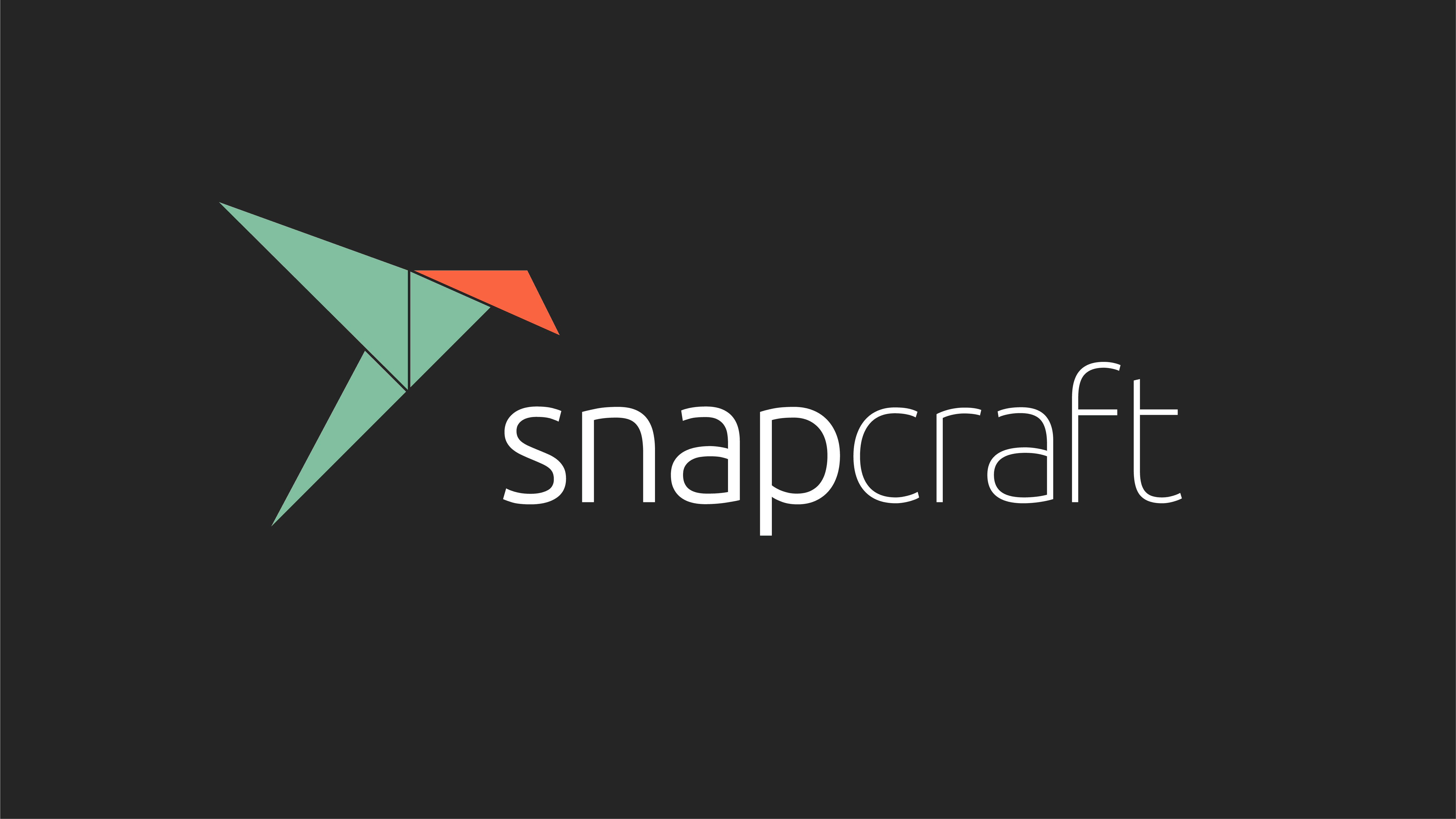
Early developments of the the Snapcraft brand mark

If you’re a regular visitor to Snapcraft.io or any of its associated sites, you will have noticed a change recently to the logo and overall branding which has been in development over the past few months. We have developed a stand-alone brand for Snapcraft, the command line tool for writing and publishing software as a snap. One of the challenges we faced was how to create a brand for Snapcraft that stands out in its own right yet fitted in with the existing Ubuntu brand and be a part of the extended family. To achieve this, we took reference from the Suru visual language. The Suru philosophy stems from our brand values alluding to Japanese culture. Working with paper metaphors we were inspired by origami as a solid and tangible foundation.
We identified the key attributes of:
Simple – to package leveraging your existing tools
Integrated – easily with build and CL infrastructure
Effortless – roll back versions
Easy – integrate with build and CI infrastructures
We worked with these whilst keeping with the overall Ubuntu brand values of:
Freedom
Reliable
Precise
Collaborative
We started exploring the Origami language and felt the idea of a bird fitted well with the attributes. We worked at simplifying the design until we had it at it’s most minimal we could whilst retaining the elegance of a bird in flight.
A new colour scheme was developed to have a clean fresh look while sitting comfortably with the primary and secondary Ubuntu colour palette. We used the Ubuntu font for consistency with the overall parent brand, and in this instance we used the thin weight along side the light to create a dynamic word mark reflecting the values of Freedom, Precision, Collaboration and Reliable.
Colour Palette

Lock-up
We have a number of different Lock-ups we can use for different circumstances