Canonical
on 12 April 2013
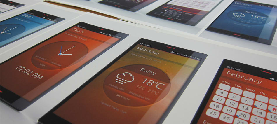
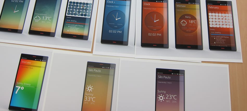
Hi everyone, following our process post last week I’m excited to share the first round of visual exploration for three of our core utility apps; clock, weather and calendar (calculator and an updated notepad soon too I promise!).
It is important to note that this is still an early stage in the design process.
Our aim was to extend the look and feel we have already established in the phone demo to the family of apps. The style we call Suru.
What we’ve concentrated on (while the functionality is being prototyped from our wireframes) is how to develop the look and feel of the apps. The accuracy of the information on the screens is yet to be developed. We’ll work on the layout of the information once we’ve started to focus on a single app.
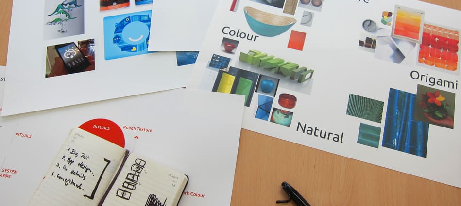
These last few weeks we have looked at developing a mood board and colour scheme for the utility apps. For example, we’ve used a combination of gradients and photo-manipulation to showcase different temperatures from locations in the weather app. We have started now to think how this gradient could influence the look of the other apps; maintaining individual styles but feeling still within a family of apps defined “rituals” metaphor.
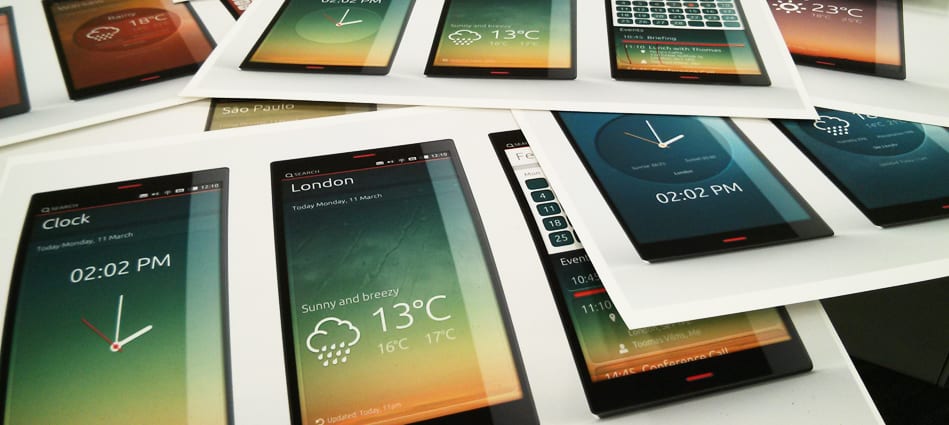
Following our design vision, we aim to focus on the essential information in each view, with a minimal, sophisticated feel. You’ll notice from these images that we’ve tried to be as clean as possible.
In the next couple of weeks we are going to concentrate on refining each concept. Even though we have a direction for layering, materials and textures they all still need a bit of love. Enjoy 😉