Canonical
on 22 February 2013
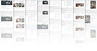
App patterns explained: content views
When designing an app, an important thing to consider in your app is how to display content.
In our design guidelines, we have provided three standard views: Grid, List and Full screen which we think will cover most situations.
Grid view
Content divided into rows and columns is referred to as a grid view.
- The grid view extends vertically.

List view
Content divided into rows is referred to as a list view and can attain a variety of appearances and behaviours.
- The list view extends vertically.
- List items can be grouped and styled differently.

Thinking of using this one? Look at the “List items” building block.
Full screen view
When a single piece of content is the main focus of the user’s attention, you should consider displaying the content in full screen view using the full screen layout.

This view looks like it needs some navigation
To navigate back to the previous view, use the page stack navigation structure.
And what about scrolling?
Scrollbars are hidden until you actually need them, so they appear on touch. The scrollbar is applied automatically whenever there is content out of view.
Ask us about content views!
Join our mailing list. We’d love to hear from you!